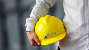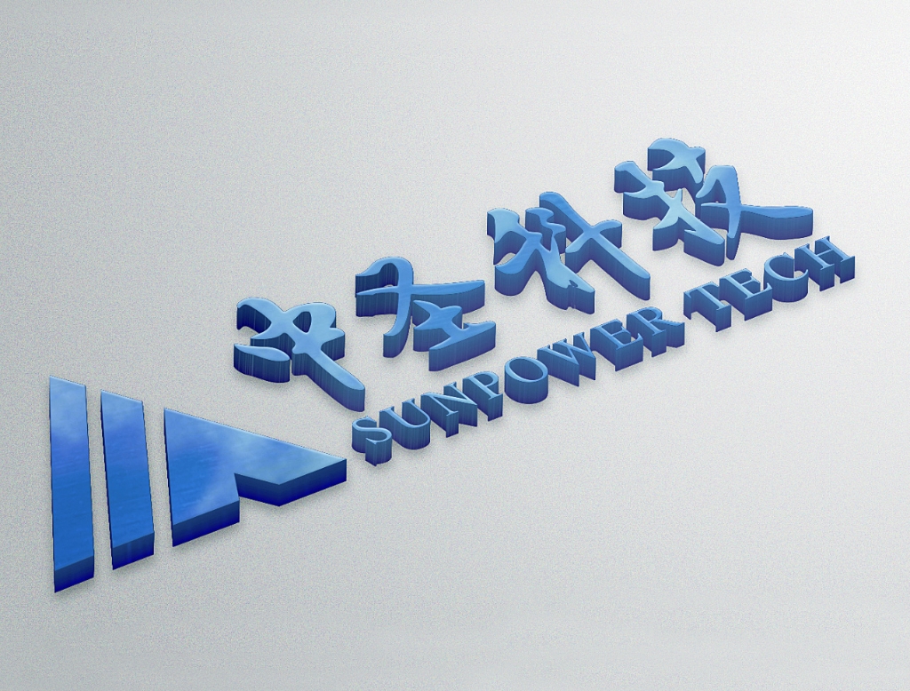
The logo design is derived from an equilateral triangle. As the basic figure in geometry, the triangle shows its firmness and stability while still being simple and natural, and the triangular arrow is facing upwards, which symbolizes the practical work style of the Sunpower Tech, and symbolizes a positive and optimistic working attitude, and the entrepreneurial spirit of forging ahead.
The whole picture is a Chinese character “people” structure. The details are arranged by three "people" characters. They contain the idea of "everyone is for me, I am for everyone", which expresses the people oriented management philosophy of the enterprise, and takes the concept of ancient Chinese language "three people is public" reflecting the determination of the company to recruit talents, rally and unite.
"Within there people, there must be a teacher for me" shows the long-term thinking of creating a learning-oriented and development-oriented enterprise. The main color of the logo is dark blue and white, which symbolizes the blue sky and white clouds, highlighting the broad minds of the Sunpower standing between the heavens and the earth and the lofty ideal of building a world-class modern technology-based enterprise.
-
Corporate mission
service leading, customer respect, employee pride, social identity
-
Corporate Spirit
Be wise and open-mined yet never extreme、Pursue the noble cause with a respectable principle
-
Corporate Values
Practicality, Innovation, Efficiency, Harmony
-
Business philosophy
energy conservation, consumption reduction and profitable environmental protection
-
Enterprise vision
Let all things in the world harmonious coexist in nature, science & technology and ecology compatible, nature and culture mutual promotion.
-
